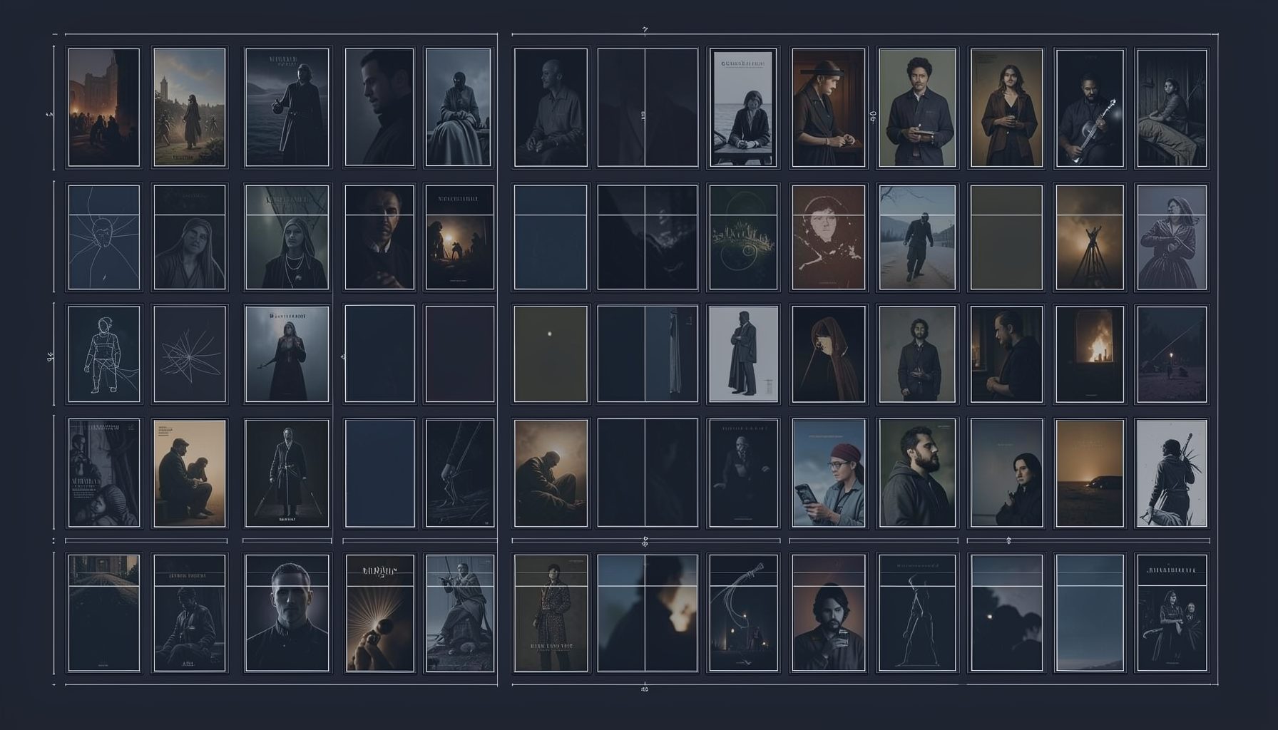
How to use color grading to set mood in adult videos
Color grading is one of the most effective ways to shape emotion in adult video without changing the action itself. A warm amber palette can make a scene feel intimate and relaxed, while cool blue shadows may create distance, anticipation, or a more stylized atmosphere. The right treatment supports the performers, setting, pacing, and intended audience.
For platforms with varied libraries, such as ШпилиВили, visual tone also helps viewers understand what kind of experience a video offers before they press play. Romantic, amateur, mature, lesbian, group, and BDSM categories can each benefit from a distinct visual language, provided the grading remains tasteful and does not obscure expressions or consent cues.
Good grading begins during production. Camera exposure, wardrobe, practical lighting, and the color of the room all affect the final image. Post-production can refine those choices, but it cannot fully repair clipped highlights, badly mixed lighting, or skin tones that were recorded inaccurately.
Why color influences emotional response
Viewers respond to color through associations built from cinema, photography, advertising, and everyday life. Red and orange often suggest warmth, energy, or urgency. Green can feel natural or unusual depending on its saturation. Blue and cyan commonly suggest calm, coolness, privacy, or emotional separation.
These associations are flexible rather than universal. A dim red room may feel sensual in one story and threatening in another. Context, music, camera movement, and performance determine how a palette is interpreted. Color grading should therefore reinforce the narrative rather than act as a decorative filter placed over every shot.
A useful approach is to choose one dominant emotional idea for a scene. “Soft and private,” “playful and bright,” or “dramatic and controlled” gives the editor a clearer target than simply asking for a “cinematic” look. This also helps maintain consistency when a video moves between rooms or changes pace.
Choosing a palette for different moods
Warm color schemes work well when the goal is closeness. Gentle gold, peach, and muted terracotta can make skin appear healthy while creating a comfortable evening atmosphere. Keep saturation moderate, since overly orange footage can make walls and skin look unnatural.
Cooler grading can support a restrained or atmospheric mood. Blue-gray shadows, subdued highlights, and slightly lowered saturation may create a private late-night feeling. Cool tones are especially useful for transitions, reflective moments, or scenes that need visual separation from a warmer section.
High-key grading, with bright exposure and soft contrast, can make a video appear open, cheerful, and spontaneous. Low-key grading uses deeper shadows and stronger contrast for a more dramatic effect. Neither is inherently better; the choice should match the environment, the genre, and the emotional rhythm.
Creators exploring narrative possibilities can also study how atmosphere operates in adult fiction fantasies. Written stories often establish tension through place, time, and sensory details, and those same principles can guide a video’s palette without requiring exaggerated visual effects.
Protecting skin tones and visual detail
Skin tone accuracy should remain a priority in adult video. Extreme color shifts may look striking in a still frame but can become distracting across a moving sequence. Use a waveform monitor, vectorscope, or calibrated display when possible, and compare graded footage with a neutral reference shot.
The most important correction usually comes before creative styling. Balance exposure, correct white balance, and reduce unwanted green or magenta casts first. Once the image is neutral, apply the creative look with a separate adjustment layer or node. This makes it easier to reduce the effect if faces begin to look unnatural.
Contrast deserves equal attention. Deep blacks can add intensity, but crushed shadows may hide body language, clothing, furniture, or the edges of the frame. In intimate scenes, subtle facial expressions and clear visual communication matter more than a fashionable crushed-black aesthetic.
Highlights also need protection. Bright practical lamps, windows, or reflective surfaces can distract viewers when they clip into featureless white areas. A gentle highlight roll-off preserves texture and gives the image a more polished, comfortable appearance.
Matching color to genre and setting
Genre does not dictate a single palette, but it offers useful starting points. Romantic material often benefits from soft highlights, warm neutrals, and moderate contrast. Amateur videos may suit a natural grade that preserves the feeling of immediacy instead of trying to imitate a studio production.
Mature or dramatic content can use restrained saturation and controlled shadows to emphasize atmosphere. Playful group scenes may benefit from brighter colors and clearer separation between foreground and background. For BDSM-themed material, strong blacks, carefully placed red accents, or metallic neutrals can support a sense of structure, though the look should never overpower safety, communication, or performer visibility.
The location should influence the grade as much as the category. A bedroom with warm lamps may need only gentle balancing, while a bathroom lit by fluorescent tubes may require careful correction to avoid sickly green skin. Window light can shift from blue to gold within minutes, so matching shots across a sequence is essential.
| Intended mood | Useful color direction | Contrast approach | Common risk |
|---|---|---|---|
| Tender and intimate | Warm neutrals, amber highlights | Soft to moderate | Excessive orange skin |
| Calm and private | Blue-gray shadows, low saturation | Gentle contrast | Flat or lifeless faces |
| Playful and spontaneous | Clean whites, lively accents | Bright and even | Distracting background colors |
| Dramatic and controlled | Deep neutrals, selective red | Strong but detailed | Crushed shadows |
| Natural and amateur | Balanced daylight, subtle correction | Low to moderate | Inconsistent white balance |
Building a consistent grading workflow
Start by organizing footage by camera, location, and lighting condition. Select a representative shot from each group and create a neutral base grade. Matching these reference shots first prevents the final video from appearing to change color every time the camera angle changes.
Next, establish the look with small adjustments to temperature, tint, contrast, saturation, and luminance. Curves allow more precise control than a single preset, especially when you want warm highlights but cooler shadows. Split-toning can help create depth, yet subtlety usually produces a more believable result.
Review the grade on multiple screens. A look that appears balanced on a professional monitor may become too dark on a phone or too saturated on a television. Check both full-screen playback and small-screen viewing, since many adult audiences browse on mobile devices.
When preparing visual collections for a platform, consistency between thumbnails and full videos also matters. A coherent preview image can help users navigate large libraries, including curated photo albums, without promising a mood the full material does not deliver.
Refining the look without overprocessing
Presets can speed up editing, but they should be treated as starting points. Apply the preset to a neutral clip, reduce its intensity, and adjust it to the actual lighting. Two scenes recorded in different rooms may need different corrections even when they belong to the same production.
Grain, glow, halation, and vignettes can add texture, but each effect should have a reason. A small amount of grain may unify mixed camera sources, while a subtle vignette can guide attention toward the performers. Too much diffusion reduces clarity and may make skin appear waxy.
Color should also support pacing. A gradual move from neutral daylight into warmer tones can signal increasing intimacy. A cooler grade after a scene change can create separation or a pause. These transitions are more persuasive when they happen gradually rather than through abrupt, heavily filtered cuts.
Practical grading habits
- Correct exposure and white balance before applying a creative look.
- Choose one emotional color idea for each scene.
- Preserve facial detail, skin texture, and readable body language.
- Match shots by location and lighting before adjusting saturation.
- Review the finished video on both large and mobile screens.
Thoughtful color grading gives adult video a clearer identity while keeping attention on the people and the story. Explore different palettes, compare audience responses, and refine the visual language across your library so every scene communicates its intended mood from the first frame.