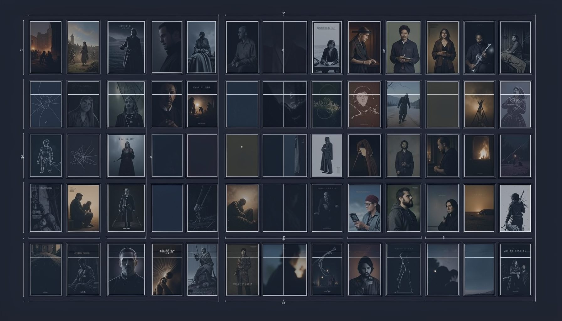
Using colour symbolism in erotic photography composition
Erotic photography depends on suggestion, mood and visual rhythm as much as on the human form. Colour gives those elements a common language: a deep red can imply heat or confidence, pale blue can create distance, and amber light can make a private scene feel intimate. Used carefully, a palette guides attention without making the image feel staged.
For Australian viewers, setting also influences how colour is read. Harsh daylight on a Sydney balcony, the muted greens of eucalyptus country near Melbourne, or neon reflections around the Gold Coast can give an image a recognisable sense of place. The strongest compositions connect those local details with a deliberate emotional tone.
Colour as a visual language
Colour symbolism works because viewers associate hues with physical sensations, memories and cultural ideas. Warm shades such as red, rust and orange appear closer to the eye, which makes them useful for drawing attention to lips, fabric, skin or a significant object. Cooler blues and greens recede visually and can establish calm, mystery or emotional space.
The meaning is never fixed. Red may suggest desire, danger, glamour or anger depending on the model’s expression, the lighting and the surrounding colours. A crimson garment against black creates a very different impression from coral linen beside cream walls. Composition is therefore about relationships between colours rather than isolated swatches.
Building a controlled palette
A limited palette usually creates a more polished result than a room filled with competing tones. Start with one dominant colour, one supporting colour and a small accent. For example, charcoal bedding, warm skin tones and a single burgundy detail can provide depth without distracting from the subject.
Complementary colours can create visual tension: blue against orange, green against red, or violet against yellow. Analogous colours, such as rose, red and plum, feel smoother and more sensual. In a small bedroom or rented apartment, a restrained palette also helps hide visual clutter and makes ordinary surroundings appear intentional.
Skin tones, fabrics and contrast
Skin is often the central tonal element in erotic portraiture, so wardrobe and backdrop should support it rather than compete with it. Earthy browns, muted olive, navy and soft cream tend to provide a stable frame for a range of complexions. Very saturated backgrounds can work well, but they need enough separation from the subject to prevent the body from visually disappearing.
Texture adds another layer to colour symbolism. Satin catches highlights and makes a colour appear more fluid, while lace breaks up a solid tone with shadow. Matte cotton feels quieter and more natural. A black garment under hard light may communicate graphic confidence; under soft window light, it can become understated and elegant.
Using natural and artificial light
Natural light changes dramatically across Australia. Midday sun at Bondi can produce crisp, high-contrast shadows, while late afternoon light in a Melbourne apartment may be softer and more copper-coloured. Shooting near a window with a sheer curtain allows the photographer to retain skin detail while giving pale fabrics a gentle glow.
Artificial light offers greater control. Red or magenta practical lights can create a theatrical atmosphere, while a dim tungsten lamp produces amber warmth. Avoid placing coloured light directly over the face unless distortion is part of the concept. A better approach is to let coloured illumination fall on a wall, curtain or bedsheet, creating a reflected wash that supports the subject without overwhelming natural skin tones.
Matching colour to mood and genre
Romantic imagery often benefits from blush, cream, warm white and muted rose, especially when combined with soft shadows and close framing. Amateur-style photography may look more convincing with everyday colours, imperfect daylight and the blue cast of a phone screen. The aim is not to imitate poor quality, but to preserve a feeling of immediacy and personal authenticity.
Mature, BDSM or group-oriented visual storytelling may use stronger contrasts and more assertive colours, provided every participant is presented with dignity and clear consent. Deep purple, black, metallic silver and dark red can suggest ceremony, control or theatricality. For lesbian or queer-focused work, colour can also support identity and community references, although symbolism should never reduce people to a preset palette.
Place, culture and audience context
Australian locations offer useful colour signatures. Sea-glass greens and sun-bleached neutrals can evoke coastal Queensland, while industrial greys and cool overcast tones suit inner-city Melbourne. A weatherboard house, motel room or rooftop can become visually distinctive through small choices such as a terracotta mug, a faded surf towel or a native-flower arrangement.
Audience expectations matter as well. Australian viewers may respond to a relaxed, unforced visual style, with familiar details such as linen, outdoor light and casual clothing. Words like “arvo” or “the servo” belong in copy and captions only when they feel natural, but local language can make a profile seem less generic. For Russian-speaking adults browsing a broad international library, bilingual descriptions and clear genre labels can bridge the gap between local imagery and platform discovery. A well-organised collection such as browse erotic stories can use palette-based tags like “warm evening,” “neon city” or “coastal daylight” alongside standard categories.
Editing without losing realism
Colour grading should reinforce the original atmosphere rather than replace it. Lowering saturation slightly can create a mature editorial finish, while adding warmth to highlights and keeping shadows neutral gives skin a believable glow. Excessive orange-and-teal grading, crushed blacks or artificial skin smoothing can quickly make an intimate image feel commercial and impersonal.
Check the photograph on more than one screen before publishing. Mobile displays often exaggerate brightness and saturation, while laptops may reveal green or magenta casts that were easy to miss. Consistent thumbnails are especially important on adult platforms, where users often compare many images quickly. If promotional placement is part of the distribution plan, relevant advertising options should show the same visual identity as the underlying gallery or story collection.
A practical palette checklist
A repeatable process makes colour decisions faster during a shoot and more consistent during editing. It also helps creators avoid relying on symbolism that feels obvious or disconnected from the setting.
- Choose one dominant hue that expresses the intended mood.
- Add a neutral tone to keep skin and important details readable.
- Use one accent colour for jewellery, lingerie, furniture or a background object.
- Test the palette under both daylight and artificial illumination.
- Match fabric texture to the emotional quality of the colour.
- Keep props meaningful, especially in small rooms or location portraits.
- Review thumbnails in greyscale to confirm that composition still works through contrast.
Before photographing, remove colours that carry no purpose, such as bright packaging, mismatched towels or distracting signage. In a beachside location, a turquoise wall may be part of the story; in a bedroom, the same colour might pull attention away from the subject. A quick test frame can reveal whether the palette supports the pose, framing and narrative.
The most effective erotic images leave room for interpretation. Colour should create a sensory invitation, establish character and shape the viewer’s eye, while consent, privacy and respectful presentation remain essential. When palette, light, location and styling work together, even a modest Australian interior can become a distinctive visual world.